5 UI Design Mistakes I Always Try to Avoid
A beautiful interface is not always easy to use. Here are five UI design mistakes I often notice—and the simple decisions I use to create clearer, more consistent digital experiences.
By Admin
August 12, 2026
5 min read
When I design a website, dashboard, or mobile application, I never focus on appearance alone.
A polished interface may attract attention, but it still needs to help people understand information and complete their goals without confusion.
Over time, I have noticed that many usability problems come from small design decisions. A crowded layout, unclear button, or inconsistent component may seem harmless, but it can make the whole product feel difficult to use.
In this article, I want to share five UI design mistakes I often avoid in my own design process.
A clear interface allows users to focus on what matters most.

Why These UI Mistakes Matter
When users open a digital product, they usually want to complete something.
They may want to find information, create an account, purchase a product, or manage their work.
When the interface is clear, users can move naturally from one step to another. When it is confusing, they may leave before completing their goal.
Poor UI design can lead to:
- Higher bounce rates
- Abandoned forms or purchases
- Lower engagement
- More customer-support requests
- Reduced trust in the product
- Frustrated users
I believe good UI design should reduce effort, not create more of it.
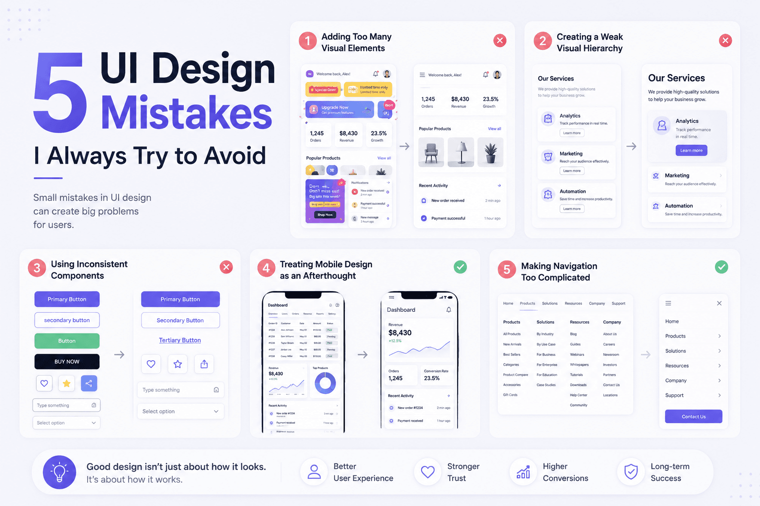
1. Adding Too Many Visual Elements
One mistake I often see is trying to place too much information on a single screen.
This may include:
- Too many colors
- Multiple font styles
- Excessive icons
- Long blocks of text
- Decorative elements without a clear purpose
- Several buttons competing for attention
When every element tries to stand out, users may struggle to understand what is actually important.
A crowded interface can make even a simple product feel complicated.
How I Avoid It
I usually begin by identifying the main purpose of the screen.
Then, I ask a simple question:
What is the most important thing the user should see or do here?
From there, I remove anything that does not support that goal.
I also use white space to separate content and make the layout easier to scan.
A strong interface does not need to display everything at once. It only needs to show the right information at the right time.
2. Creating a Weak Visual Hierarchy
Visual hierarchy tells users where to look first.
It helps them understand which content is most important, which elements are connected, and what action they should take next.
Without clear hierarchy, headings, descriptions, buttons, and images may all feel equally important.
The result is often a flat and confusing experience.
How I Avoid It
I use several design elements to establish hierarchy:
- Larger text for main headings
- Smaller text for supporting information
- Stronger contrast for primary actions
- Consistent spacing between sections
- Clear grouping for related content
- Different visual weight for primary and secondary buttons
I often zoom out from the design or blur my eyes slightly to test the hierarchy.
Even without reading every word, the main structure should still be easy to understand.
Strong visual hierarchy helps users understand what to read and do first.

3. Using Inconsistent Components
Consistency is one of the details I pay close attention to.
When the same action appears differently across several screens, users may start questioning whether those elements perform the same function.
For example, a primary action might appear as a blue button on one page, a text link on another, and an icon somewhere else.
Common inconsistencies include:
- Different button styles
- Uneven spacing
- Changing icon styles
- Multiple border-radius values
- Inconsistent form fields
- Different typography rules
These details may seem small individually, but together they can make a product feel unfinished.
How I Avoid It
I create reusable components and simple design rules from the beginning.
These usually cover:
- Buttons
- Input fields
- Cards
- Colors
- Typography
- Icons
- Spacing
- Navigation elements
A design system helps me keep every screen visually connected.
It also makes collaboration with developers much easier because the same components can be reused instead of recreated repeatedly.
4. Treating Mobile Design as an Afterthought
A desktop layout does not automatically become a good mobile experience.
Mobile users have less screen space and interact with the interface using their fingers instead of a mouse.
A layout that looks clear on a large monitor may feel crowded or difficult to use on a smaller screen.
Common mobile problems include:
- Text that is too small
- Buttons that are difficult to tap
- Crowded navigation
- Content extending beyond the screen
- Forms with too many fields
- Images that do not resize correctly
How I Avoid It
I consider mobile behavior early in the design process.
I check whether:
- Text remains readable
- Buttons have comfortable touch areas
- Content stacks naturally
- Navigation stays simple
- Forms are easy to complete
- Important actions remain visible
Sometimes I also simplify certain sections rather than forcing the desktop layout into a smaller space.
Responsive design is not only about resizing elements. It is about adapting the experience to a different context.
5. Making Navigation Too Complicated
Navigation should help people find what they need without thinking too much.
When menu labels are unclear, important pages are hidden, or there are too many options, users can quickly feel lost.
Some common navigation issues include:
- Too many menu items
- Unclear page names
- Hidden primary actions
- Multiple navigation patterns
- Missing back buttons
- Complicated dropdown structures
I try to avoid clever labels when familiar words would be clearer.
Users should understand where a link will take them before they click it.
How I Avoid It
I keep navigation simple, predictable, and connected to the user’s main goals.
For a typical website, familiar labels such as these are usually enough:
- Home
- About
- Services
- Pricing
- Blog
- Contact
When a website contains more pages, I group related content instead of placing every page in the main menu.
Good navigation should almost disappear into the experience because users can move through it naturally.
Responsive and consistent components create a smoother experience across every device.

How I Review a UI Design
Before finalizing an interface, I usually review it from the user’s perspective.
I check:
- Is the main purpose immediately clear?
- Can users identify the primary action?
- Is the content easy to scan?
- Are components used consistently?
- Does the layout work on mobile?
- Is the navigation predictable?
- Are there any unnecessary steps?
I also believe user testing is one of the best ways to identify hidden problems.
A designer may understand the interface because they created it. A new user does not have that same context.
Watching someone interact with the design can reveal unclear labels, confusing buttons, and steps that seemed obvious during the design process.
Final Thoughts
For me, good UI design is not about adding more elements.
It is about making intentional decisions that help users understand the product and complete their goals with less effort.
Avoiding clutter, weak hierarchy, inconsistency, poor responsiveness, and complicated navigation can make a major difference to the overall experience.
At Metamorph Lab, I aim to create digital products that balance strong visuals with clear usability.
Whether I am working on a website, dashboard, or mobile application, every design decision should help the experience feel simpler, more consistent, and easier to trust.
More articles

Why Good Design Builds Trust
Good design is more than visual appeal. It helps brands comm...
By Admin
UI vs UX: What is the Difference?
UI and UX are often mentioned together, but they focus on di...
By Admin

Where Is the Line Between Friendly and Inappropriate at Work?
Navigating workplace interactions can be tricky—what starts ...
By Admin

Toxic Work Culture Isn’t Always Obvious
Not all toxic work cultures are loud or obvious. Sometimes, ...
By Admin